Essentially, PWAs are mobile apps that are delivered through the web. By using an app shell and pre-caching on a user’s phone, they can be added to the home screen and will load instantly.
Google states that 53% of users will abandon a site if it takes longer than three seconds to load. As a result, the functionality of a PWA can simplify the online shopping experience, and even improve conversions.
Recently, we’ve seen a number of ecommerce brands capitalise on the technology. Here’s a roundup of some of the best PWAs around.
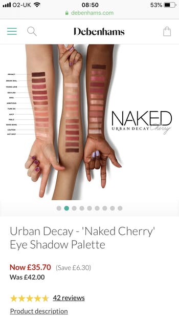
Debenhams
In 2017, Debenhams found itself struggling to convert mobile customers. This was in spite of the fact that 57% of all online traffic to Debenhams came through its mobile channel.
As a result of this, Debenhams decided to invest in a progressive web app – the first UK retailer of its kind to do so – which it delivered in just four months through the Mobify platform.

The result is a super-fast and responsive PWA, which makes browsing via mobile easy and surprisingly enjoyable. According to Google, the journey time from browse to purchase is now two to four times faster than on the previous mobile site. With slow load times a huge bugbear for online consumers, and something that was previously contributing to user abandonment on Debenhams’ mobile offering, speed has been a huge part of its success.
During the peak trading period in 2017, Debenhams’ mobile revenue overtook desktop revenue. What’s more, the PWA contributed to a 40% increase in mobile revenue and a 20% increase in conversions for the retailer overall.
Hobbycraft
Hobbycraft is another UK retailer to have launched a PWA with Mobify, following on from Debenhams’ successful example. The decision to do so was based on the fact that consumers tend to buy arts and crafts items on a project-by-project basis. For a craft supplies retailer, this means that, again, speed is paramount, with shoppers wanting to order items as fast and as easily as possible.
Earlier this year, Ben Davis’ article on Hobbycraft’s PWA highlighted how the retailer delivers in this area. With clear and easy-to-use filters and great site search – it offers a fast, convenient, and enjoyable mobile UX.
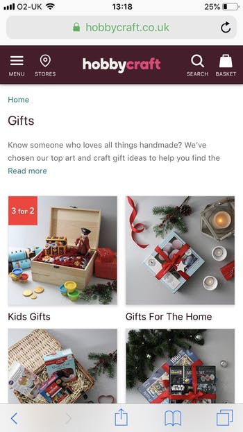
Hobbycraft’s PWA is also part of the retailer’s continued and wider focus on multichannel, which is already paying dividends. In July of this year, the retailer reported growth in all channels, specifically an online growth of 21.5%.
George at Asda
Native apps tend to generate greater dwell time, largely because they allow the user to become more immersed in the mobile experience. However, it can be difficult to persuade users to download apps in the first place, especially considering they take up valuable real estate on the user’s home screen.
For George – ASDA’s clothing brand – a PWA was the perfect solution.

By including an “Add to Home Screen” prompt on its PWA, the retailer saw a 28% increase in customer time on-site. Elsewhere, George saw a 31% increase in conversion and 20% more page views per visit. Page load time was also reduced by 3.8x.
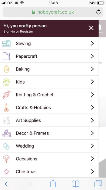
As well as speed, a feature to appreciate about George’s PWA is its navigation, particularly small details like links to associated category pages. For example, when viewing a category like ‘women’s partywear’, the retailer includes links at the top of the page for related (and sometimes niche) categories like ‘shapewear’.

BMW
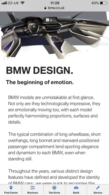
Mobile might not be the most valuable channel for automotive brands – consumers typically prefer making large and luxury purchases in-store. However, the browsing stage is becoming an increasing part of the overall customer experience, which is why BMW decided to use a combination of Google AMP and PWA technology to relaunch its mobile site. AMP stands for accelerated web pages, which involves a stripped down form of HTML.
BMW relaunched its site with a PWA shell, which houses AMP content. This allowed the brand to include a vast array of high-quality editorial content – including videos and long-form articles – but retain super-fast loading speeds.
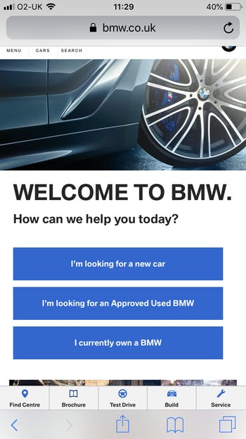
The aim was to capture the user’s attention in moments of down-time while searching for car and design-related content on mobile. BMW succeeded in this regard, with the number of mobile users climbing to 50% – up from 40% previously.
What’s more, the proportion of visitors clicking through from BMW.com to a national sales company website rose from 8% to 30%.
Lancôme
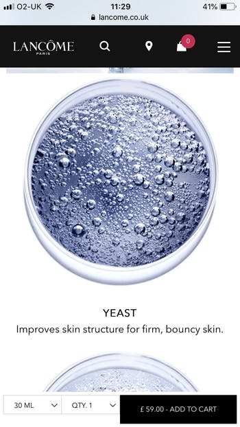
Loyalty is typically an important focus for beauty brands, but it should never come before a good UX. In 2016, the latter became a priority for Lancôme, when the brand realised that customers were failing to convert on mobile (despite strong rates on desktop).
As a result, it decided to launch a PWA, with the aim of creating a more immersive experience for mobile users (and to remove the barriers that were preventing conversions).

Another motivation for Lancôme was re-engagement, particularly for mobile shoppers who browse or add items to their basket and then abandon the site. To combat this, it added push notifications to alert users of new or previously browsed products and exclusive promotions.
The technology proved to be successful, with 8% of consumers who tapped on a push notification going on to make a purchase – a figure higher than the desktop conversion rate. Meanwhile conversion rates on mobile abandoned carts also increased by 8%.
In conclusion…
When debating whether or not to invest in a progressive web app, it’s a common assumption that the technology would have to be an overall replacement for a native app. This is not necessarily the case, however, as the two can work together and indeed complement one another.
Customers who regularly interact with a PWA might be inclined to download a native app at some point in future. At the same time, a PWA can be used to reach and engage new customers, as well as solve issues around conversion and cart abandonment.
For ecommerce brands, a PWA is certainly a good solution to speed issues. But much more than this, it’s also a great way to improve overall mobile strategy, and deliver an all-round superior UX.
Learn more
For more on how to take your mobile UX to the next level, download Econsultancy’s guide to User Experience and Interaction Design for Mobile and Web.

I’m interested that you’d define BMW as an e-commerce brand. Do you have any research on people actually buying luxury vehicles online?