Upselling is when you persuade a customer to buy a more expensive item or upgrade a product or service to make the sale more profitable.
As a sales tactic, it can come across as pushy when done in-person, but online, it’s easier for companies to take a subtler approach. What’s more, ecommerce brands are able to delve into data to better understand what items or services would be the most relevant to the customer.
Much like cross-selling, not attempting to upsell when the customer is already in a buying frame of mind can be a wasted opportunity. So, let’s take a look at how some of the most successful ecommerce brands of the moment are using upselling online.
Deliveroo
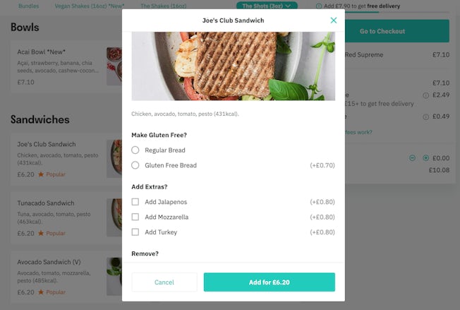
You might not think to ask for extra ingredients when ordering a sandwich in-store, but Deliveroo increases the chances of add-ons simply by giving customers the option before they check out.
Extra mozzarella, perhaps a smoothie to go with it (with an extra ginger shot), and before you know it, Deliveroo has successfully upsold you to an entirely new meal you didn’t know you wanted.

Dollar Shave Club
Dollar Shave Club has expanded its product offering, and is drawing new users into signing up to a box of both shaving and grooming products (which they can subsequently choose to remove items from in later boxes).
There’s still the option to choose just blades, however, and the brand cleverly puts the most expensive option first, with the lower priced (and perhaps less preferable) options found lower down on the page.

The names of high-end razors are also designed to be more appealing than their budget alternatives, with the ‘Humble Twin’ – the name of Dollar Shave Club’s cheapest razor -sounding rather unappealing in comparison to ‘The Executive’. These simple UX and design tricks help to encourage the customer to go for the most pricey option, regardless of need.
Look Fantastic
Another effective upselling tactic can be to offer a discount on a minimum order price; Look Fantastic does this by enabling the customer to save 10% or 15% when they spend £80.
If a customer is spending close to this amount already, the offer is likely to nudge them to buy an extra item that they might not have previously considered.

You might assume the discount would negate any benefits for the retailer, but the aim is to encourage lots of customers to take advantage of the discount, increasing the number of overall sales in the process.
Pro Flowers
Unlike other retail sites, customers on florist websites are typically shopping for other people, meaning they’re more likely to want to make a good impression.
Consequently, brands like Pro Flowers upsell to the max, giving the customer four different bouquet sizes to choose from. The site cleverly selects the second-lowest price automatically, too, which immediately increases the chances of upselling.
If it were set at the cheapest, the customer might go to the second-highest rather than the third, and this way they’re less likely to want to downgrade.
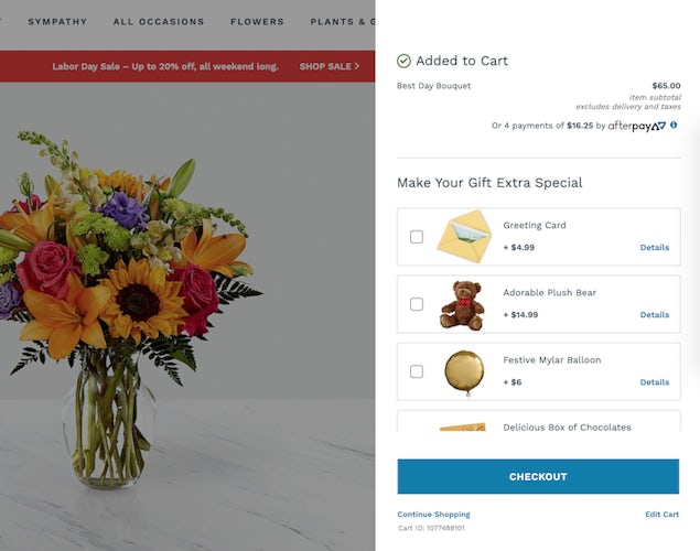
Pro Flowers nicely cross-sells at the checkout, too, encouraging customers to add on extra items like a greeting card to bump up the final price.

Tesla
Let’s move up-market for a second. The Tesla site enables users to configure their cars before purchasing. Not only is this a good piece of UX design, but it is also an opportunity for some upselling.

Users have the option of upgrading on everything as they configure the car, including the wheels as well as the autopilot feature, for an additional cost.
Away Travel
Away Travel subtly upsells on its product pages. Here, for instance, it asks customers if they “want an even more flexible and roomy carry-on?”, pointing them in the direction of the expandable version of the suitcase they are browsing.
This naturally piques the customer’s interest in more expensive suitcases, while subtly promoting the item’s benefits. Away also uses a side-by-side comparison to promote the perks of the larger case.
Finally, Away gives customers the option to personalise their purchase for an additional cost of £10, which is probably low enough for customers to accept without much consideration (particularly as they are investing in an already-high price item).

Sky
Sky also uses a side-by-side comparison for its broadband packages. However, subtle design elements help to nudge customers towards the more expensive option. First, the barometer indicating average download speed is clearly much better with superfast (and looks to be blatantly poor on the alternative).
Urgency is also used. The superfast option is reduced from £27 to £25, with this ‘limited time offer’ indicating to customers that they’re currently eligible for a good deal.

InterContinental Hotels
There’s no such thing as a ‘one-size fits all’ hotel room. Most hotel chains offer users an array of options, each one with additional attributes and higher costs.
InterContinental Hotels, for example, starts with the number of beds (aiming to upsell to ‘suite’). Once the user has chosen this, there’s still opportunity to ramp up the price, with InterContinental offering extra flexibility for a higher cost. This is particularly clever, as customers are always more likely to choose the refundable option as standard.

Easyjet
Airline are notorious for upselling, with some even veering into underhanded tactics in order to ramp up costs. Most large and respected airlines are upfront, however, offering customers the option of additional paid-for services for convenience.
Choosing where you sit is a good example, and one that provides the customer with clear benefits in return (i.e. not getting stuck with a middle seat). Not everyone cares, but there will be some that do, meaning it’s an effective way for Easyjet to upsell.

Healthspan
Healthspan offers customers the option of a subscription instead of a one-off purchase. With the same starting price and subsequent cheaper monthly payments, it doesn’t sound like an upsell. However, the subscription option guarantees that the customer will make repeat payments (until they actively cancel), meaning it’s an effective way to drive additional sales.

When does upselling become an underhanded tactic?
Upselling can certainly be an effective sales tactic, but retailers need to be careful about potentially deceiving customers.
If a customer finds additional items have been added to their basket at the checkout, for example, or if the website design deliberately distracts or misdirects the user – you run the risk of alienating customers entirely. This is also what’s known as a dark pattern: a part of design UX that tricks the user into making a decision that solely benefits the business.
Consequently, a good rule of thumb to use when upselling is to consider whether or not the additional or more expensive item has a clear benefit to the customer. What’s more, is it relevant to their individual needs – or does it align with previous purchase behaviour? Not only will questions like this help you to avoid alienating the customer, but they’ll also enable to you to upsell more effectively.
Find more UX research, trends and best practice in our User Experience and Usability hub.


Comments