I’ll mostly be looking at major features that these apps have in common, such as homepages, browse and search. I have both services already, so I won’t be walking you through the sign-up processes for either of these services – but from memory they were both about as painless as each other.
Opening the app
From the off there are very different and distinct ‘homepages’ on each app. Let’s start with Spotify, which opts for a very visual, image-led display with emphasis on icons and images to engage the user.
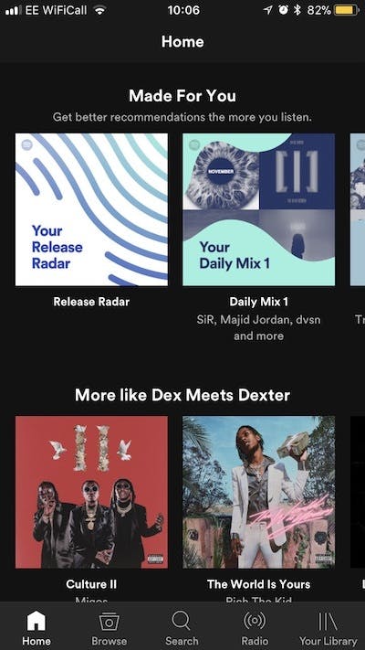
This screen is home in all senses of the word for the app – clearly headed sections draw the user’s attention towards a particular feature or journey, to find music without moving off page one.
Spotify is clever in its approach – having a long ‘home’ page enables the user to find lots of content (‘made for you’, ‘more like’, ‘recently played’, etc.) without having to navigate the footer menu.
The sleek design also makes the most of the sideways swipe, with each feature’s slider providing you with sub-genres and curated playlists.
You could quite easily visit only this page for your music fix – probably most notably the ‘made for you’ section which hosts playlists and mixes based on what you listen to when you’re on the app. Machine learning at its most effective!
There are some really interesting and cool features to add value for music lovers here, such as the ‘concerts near you’ section, which provides you with a list of upcoming gigs also based on artists that you listen to regularly (don’t expect to see anything from Justin Bieber unless you’re a genuine Belieber).

Apple Music takes a slightly different approach. The app doesn’t actually have a ‘home’ screen by name, in the way that Spotify does, instead using the ‘library’ tab as the default homepage for users (note that Spotify has a separate library page).
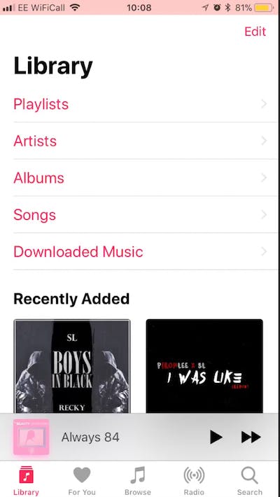
‘Library’ elicits a feeling of ownership, which may be part of the reason Apple opted for this language (with a history of users buying music through iTunes) but that’s not the only way it differs from Spotify.
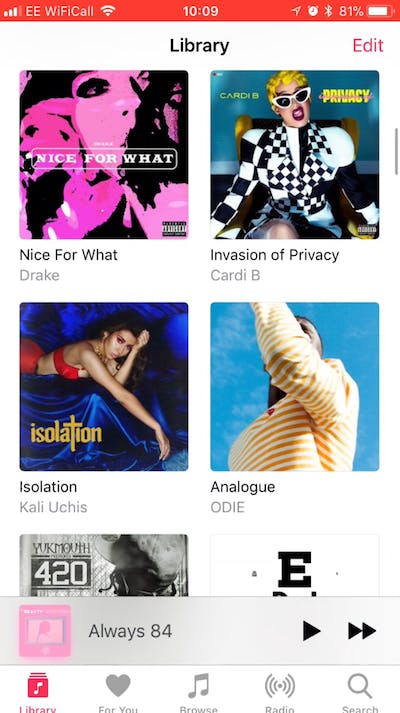
Instead of a page of discovery (suggested playlists and aggregated mixes) Apple opts for a menu-led approach. These dry category links (‘albums’, ‘songs’, ‘downloaded music’) and ‘recently added’ tiles indicate that although this is your library, if you want anything outside of what you have already listened to, you may have to work for it (i.e. use the footer menu). Which leads me on to….
Browse
Both apps have a browse feature in the footer menu which gives you the opportunity as a user to properly refine what you’re looking for. Again let’s take a look at Spotify first…
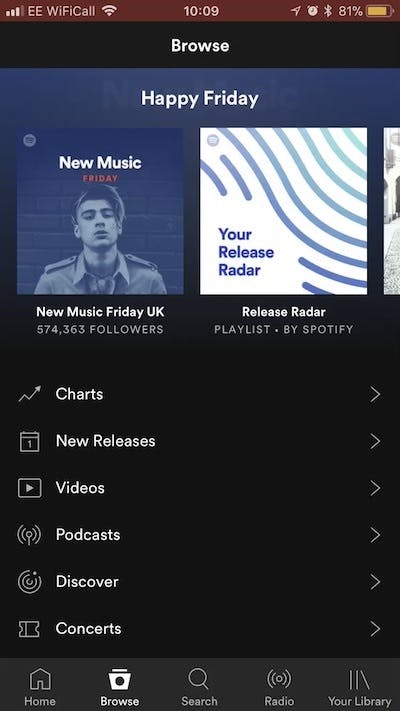
As with the ‘home’ page, Spotify maintains its visual approach at the top, with a slider of personalised playlists such as ‘Happy Friday’. This is a really nice touch that plays to the growing expectations of users – if you’re learning about me as I listen, I expect to be served something that at least makes sense (doesn’t put me off too much) when I want to have a wander through the musical universe.
Below this slider there are six different filters users can choose (from ‘charts’ to ‘videos’ to ‘podcasts’), making it clear that the user is in control of what they want to consume even when they’re browsing.
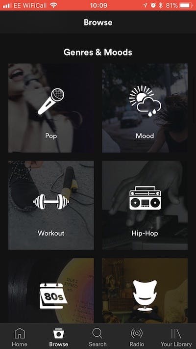
An additional nice touch is the ‘discover’ option, which immediately piques user interest to engage further with the app (spoiler, you’re met with more playlists based on artists and albums you frequent). Keeping with the theme of the app, once you scroll down below the fold you’re greeted with ‘genres and moods’ an eclectic range of 36 different genres, activities and moods from K-Pop all the way through to sleep (represented by tiles each with its own icon) – a little something for everyone.
Apple opts for a similar approach – topical curated playlists at the top using the same sideways swiping as Spotify for navigation. Again, like Spotify, there are six distinct categories designed to make the experience of browsing music as easy and organised as possible.
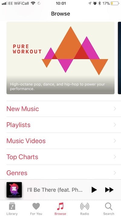
But whereas Spotify again gives you 36 genres and moods on the one page, you’re a further tap away from getting to a similar list on Apple Music. With this said, Apple could argue that the categories on the browse page are distinct enough that users shouldn’t really get too lost as they know exactly what they’re getting from each tap of the screen.
Radio
A feature that Apple Music prides itself on is its Beats 1 Radio feature, which Larry Jackson, speaking to The Verge in 2017, called “the biggest radio station in the world,” adding, “There’s no way you’re going to find another station that has as many concurrent listeners.”
And you can see why as soon as you click. From hosted shows by famous artists and a selection of curated radio shows you can tell this is where Apple is really interested in people using the platform and the experience is really impressive.
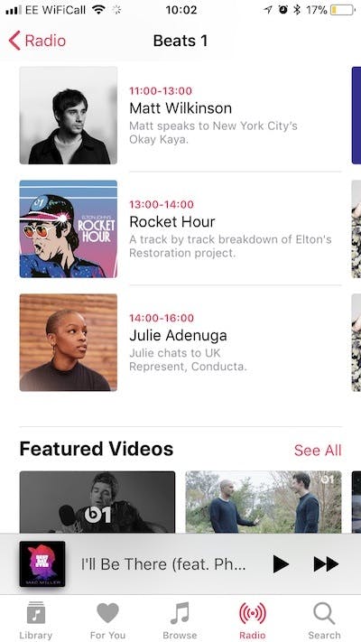
The use of influencers, radio DJs and artist-led shows help to make the user feel as if they’re listening to some of the newest music in tandem with their favourite artists.
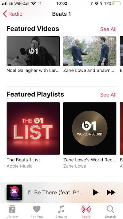
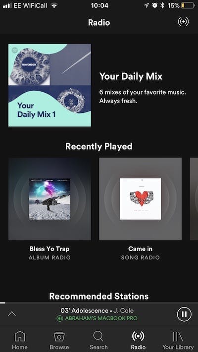
Apple does seem to have taken a leaf out of Spotify’s book when it comes to heavy imagery and a much longer scrolling experience. However, if we’re looking at this objectively, it’s clear that this, from a user’s perspective, is where Apple Music excels and Spotify struggles. It’s almost like a role reversal – with Spotify having less inspiring content discovery in its radio feature and simpler signposting of content.
Search
Search is probably the most important feature to get right on apps that claims to have all the world’s music at your fingertips. Putting aside the increasing use of voice search (through Siri and Google Assistant), it’s good to take a look at which of the two streaming services are providing users with what they want most effectively in-app.
Spotify’s search function is very predictive and intuitive. As soon as you type a letter results appear straight away and true to form there is a visual stimulus (in the form of an artist’s picture or playlist cover) to greet you. Also true to form, all of the associated results (songs, artists, playlists) are based on artists that you listen to most which really helps hammer home the personalised experience when using the app.
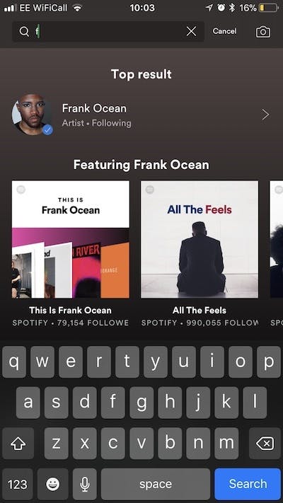
Even from the search function, it’s clear that Spotify wants you to stay on one page, with a lot of content based on your listening behaviour and the collective top results, until you’re ready to move onto the next page. There’s something really neat and tidy about this and as long as you don’t mind scrolling it’s super easy to find your desired song, album and artist etc.

Apple provides a much less visual list of results, suggested based on popular searches (it would appear) by everyone using the app. It is predictive, just like Spotify, and like much of the app the search results are really text heavy, appearing as a list with some iconography to help users distinguish between artist, song and album.
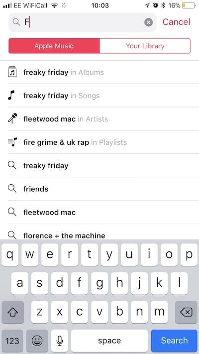
A cool feature that Apple Music does have in search though is the ability to flick between searching Apple Music or just ‘Your Library’. This can be really useful if you have a lot of music/videos saved to the Apple cloud and/or saved to your phone and want to just see what you do have available to you without having to stream it or download it.
Closing comments
Our relationship with music is and always will be changing and it’s up to the streaming services that we commit to to provide us with an easy and delightful experience when using their apps. The ‘Spotify vs. Apple Music’ debate is one that is often based more on personal preference than anything else and although we can look closely at functionality and suggest where one is outperforming the other, it’s easy to miss the fact that there is no ‘one size fits all’ approach that will please everyone that uses the product.
Spotify has been the major player in the music streaming world for some time now in part due to lack of competition but also down to their great user interface, but if recent reports are anything to go by Apple Music is slowly but surely nipping at their heels in the market (Wall Street Journal predicts that Apple’s superior growth rate – 5% to 2% – could see it surpass Spotify for users). Who needs all those images anyway?

Comments