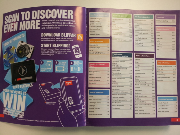
Explaining the process
On the standard Argos catalogue the inside cover is given over to a tutorial on QR codes, but the special edition dedicates the same space to run through on how to use Blippar.
It instructs the reader how to download the app and then use it to access the digital content, promising “a direct link to online products, additional range and video features.”
The front cover is Blippable, but for no other reason than to allow shoppers to enter a prize draw for £1,000 in Argos vouchers. It’s essentially a data capture exercise, but the prize on offer was enough too convince me to part with my email and postal addresses.

There are then further Blippable pages in each different section of the catalogue that allow the user to access additional product information on things like jewellery and kitchen equipment.
Most of the interactive pages follow the same design and use a simple ‘Blipp Me’ call-to-action, however others have a more detailed set of instructions: “Scan this page to find these products and more at Argos.co.uk.”
UI
Scanning an image isn’t a particularly quick process and it takes around 10 seconds for the app to recognise the page then upload the digital content.
Each page produces the same interface but with different product selections, so users should be familiar with the process once they’ve used it a couple of times.
The app gives you three options for each item: product detail; play video; and view full range.


This is a decent range of options, though it might be worth including a ‘Buy now’ CTA to see if it attracts a few impulse purchases. But users can buy or reserve items through the ‘Product detail’ button anyway, which links you directly to a product page on the Argos site.
One weird aspect of the product pages is the two big arrows that appear at the top of the screen. You can’t actually press them and they take up quite a lot of the screen, so it would be a good idea to get rid of them.
Use of video
Product videos have proved to be an excellent sales tool online, so it makes sense to run tests to see if video has the same impact when integrated into a print catalogue.
Argos should definitely be applauded for its efforts, however I think the product videos themselves could be improved.

For example, though all of the products included in the AR trial have a ‘Play video’ CTA many of them link to the standard Argos TV ad on YouTube.
For items that do have unique videos, the clips just show the products slowly spinning in a circle which doesn’t give the viewer a huge amount of new information. Why not show someone trying the item on to give a better idea of the size and style?
In conclusion…
Argos has done a good job of integrating AR into its catalogue as it involves a broad range of products and actually serves a purpose rather than appearing purely as a PR stunt.
The CTAs and tutorial explain how to interact with each Blippable page, and the UI is easy to use.
I do feel there could be a few improvements though, such as tweaking the CTAs and removing the strange arrows from the product pages.
However the biggest gains could probably be achieved by improving the videos to include actual product demos rather than just showing the items slowly turning. Similarly, if Argos doesn’t have specific product videos then the ‘Play video’ CTA should be removed rather than linking users to a generic TV ad.
Overall, it’s good to see Argos trying out new digital technologies in its print catalogue, but I still feel that there are too many bugs in the AR user experience and remain unconvinced that the technology has a long term future.

Comments