These frustrations are not unique to sale shopping, but can be exacerbated at this time of year, when stock is changing rapidly and shoppers are determined to score a bargain ahead of others.
Note, most of my list is focused on faceted navigation, but I know there are plenty more UX issues in other areas, so if you’re a frustrated sales shopper, feel free to add to my list in the comments.
1. Page refresh every time I click a filter
Faceted navigation is essential when sales shopping, otherwise you may get served lots of products that look great until you discover they are available only in extra small or neon yellow.
As useful as filters are, they can be annoying, too. For example, when I want to narrow down by brand on John Lewis’s website, every time I select a brand, the page refreshes and I have to scroll back down to the right part of the nav in order to select another filter.
If I want to choose five brands, this takes time.
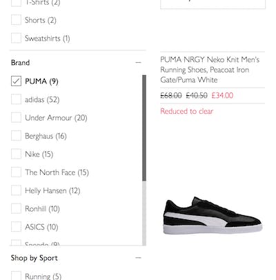
This UX is common on many ecommerce sites, but others have solved this problem. Take ASOS, where although there is a brief load when I select a brand filter, my cursor and the brand filter remain in the same position, meaning everything feels much smoother (and is quicker).
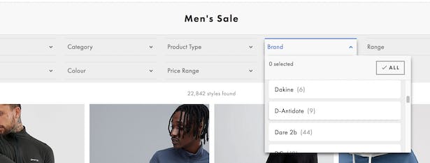
For department stores with big product catalogues, it would be nice to have such a seamless faceted navigation.
2. Product listings that don’t open in a new tab
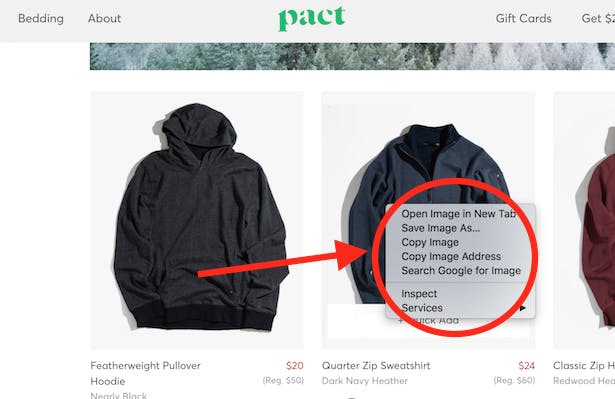
Most sane shoppers want to right click on a product listing and open in a new tab. Some ecommerce websites do not allow this, simply allowing you to open the product image in a new tab. Pointless.
Granted, this is getting rarer. But it can still be found – for example on organic cotton brand Pact’s website (a brand that is stocked in Target).
3. Items out of stock but still showing in product listings
This is a classic issue and is most annoying when there is no indication in product listings that an item is no longer available. The Levi’s website had this problem when I browsed it (up until today, 2 Jan). I would search jackets and find attractive listings, only to click through and find the following….
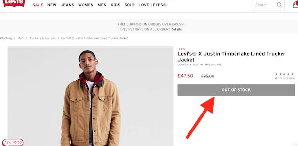
This destroys confidence in browsing.
4. Inconspicuous ‘out of stock’ messages in product listings
John Lewis is marginally better than Levi’s in that it displays an ‘out of stock’ message in the product listings, but it must be said that this message is somewhat inconspicuous.
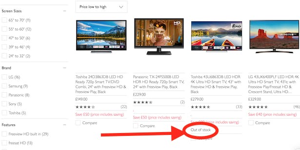
From a user’s perspective, it would be better if these listings were greyed out, and any options for updates on availability could be highlighted (admittedly rare functionality).
5. Confusing faceted navigation
I’m rounding on Levi’s again. I did buy some jeans in the sale, but the retailer is lucky it has a relatively small product catalogue, because the faceted navigation is slightly strange.
Filters for ‘male’ and ‘men’…
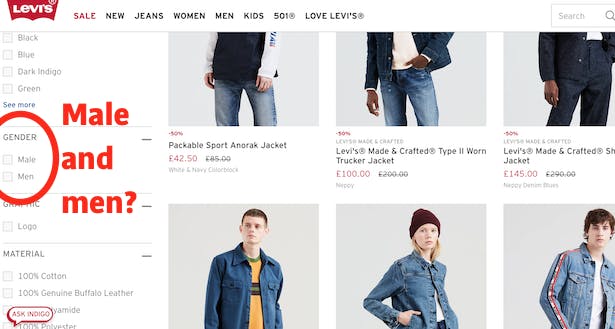
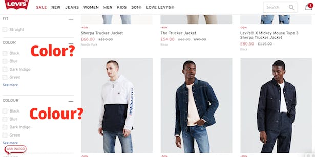
…plus ‘color’ and ‘colour’. Again, it doesn’t inspire confidence.
6. Irrelevance in Google ‘Shopping’ ads
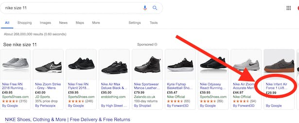
The particular instance I have in mind is searching for a particular brand or model of shoe in my size and being returned Google CSS ads for infants shoes. What a waste of ad spend from Foot Asylum in this instance.
7. Inaccurate size filters
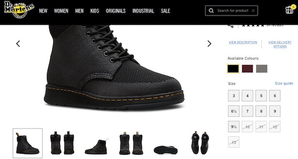
Again, this may be down to the fact that stock sells out, and this doesn’t update quickly enough in navigation, but it’s mighty annoying to think you’ve found the right shoe, and then discover if you really love it, you’ll have to squeeze into a 10 instead of an 11.
Dr Martens is one offender here.
8. No ‘view all’
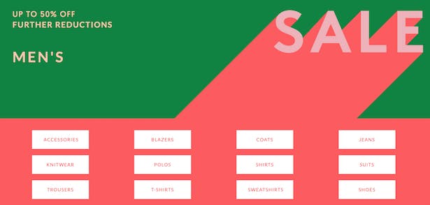
I went on the Paul Smith website. A bit out of my price range, but I wanted to view all sale items, sort from low to high price, and see if there was anything reasonably priced I might like.
But I couldn’t view ‘all sale’, only by category. Not a big problem for those who know what they want, but more browsing (and chance of abandonment) for me.
9. No price sort
Paul Smith was the culprit again. Some categories did not allow me to sort by price. In this case, ‘accessories’.
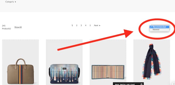
In general, I’m not a fan of designer retail declining to offer a price sort, even if in this case it is likely unintentional.
10. Endless, tiresome scroll
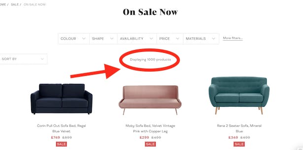
Made.com shows me 1,000 sale products on one page. Even when I use a filter and narrow this down to, say, 218 wooden products, this is still overwhelming.
I like scrolling but there’s a point at which you’ve done so much scrolling you lose track of whether it’s 2018 or 2019. Plus, if I want to save my place, any reloading of the webpage would scupper where I was up to in my browsing.
Pagination with an option for how many products to display tends to suit user habits best in my opinion.
That’s your lot. Disparage my opinions or add your own in the comments.

A good read Ben – I’ve seen point 1 and 2 on so many [reputable brands] sites’ that it surely must be a conscious decision. I can only see benefits technically too – by doing one call once the customer has decided the filters they want, instead of 7.
Another one (perhaps 1b) is the sorting function resetting itself when you choose a new filter and the page refreshes. Part of the page reset issue, perhaps, but I still want to sort by price now I’ve narrowed it down to size Medium…
Have you used thread.com? Great concept, helpful content but you haven’t experienced difficult until you try to work out how to remove all Boohoo MAN results (spoiler, it involves clicking about 400 other brands one by one).
Chris
Haha, I like a pointless challenge, especially on my second day back in the office after holidays. Thanks for reading, Chris!
Ben Davis
Econsultancy blog editor
Totally agree about thread filtering – it’s hugely frustrating!
Great summary Ben, I’ve shared with my trade team, highlights those pinch points on site,
We have see similar feedback in our Hotjar and CS feedback and pleasingly some we’ve managed to rectify in previous years we still room to improve!
The filtering is a major gripe of mine when you want to whittle it down and spend a ridiculous time clicking away when re filtering ! Department stores are usually the culprits so not surprised on JL being pulled out 😀
Laura
thanks, Laura
Nice round up Ben, thanks for sharing. I recognised myself in your frustrations, same thoughts cross my mind when I’m shopping!
Another one I’ve found really frustrating recently, as I shop more sustainably, is brands not giving the option to shop by material – e.g. wool vs polyester – or providing a filter to be able to identify their more sustainable options.
Even where this is an option – e.g. H&M allows to filter by collection – the filter doesn’t seem to work properly, as it returns products that are not part of their ‘Conscious’ collection.
A good example is NotOnTheHighstreet, which offers an ‘eco-friendly’ filtering option, while Trouva, on the other hand, doesn’t have a similar option.
As more and more consumers care about the sustainability of their choices, I believe this is important for mainstream websites to adopt.
Ellie
Great point and one I haven’t considered before.
hi Chris
Thanks for the post.
I’d argue that having items that are out of stock (OOS) in the list page is useful from an SEO point of view and data gathering point of view (understanding potential lost sales). I’d also argue it’s also useful for consumers to know that the retailer does normally stock it but it is OOS as not all retailers carry all the range of a brand.
Several of your comments relate to poor data and catalogue management which are relatively trivial to resolve. This is down to management of the source data/ PIM / product data enrichment. I agree from a consumer POV that they are very irritating!
However points 1, 5 and possibly 10 are technology or implementation-related and likely inherent to the platform or search/merch tool setup. These will likely involve a project of some sort to resolve.
Last, I’m not convinced all shoppers want to open a new tab to see a product page – often opening in the same tab is easier as long as the navigation still allows you to recover your list (at the same position), simply.
Hi Mark. Agree with your contentions / clarifications. Was venting a bit, even if many of these issues are solved fairly easily and in the same way. Thanks for reading!