So, who does it well, and why does it work? Here’s 10 great examples.
(Before we start, remember to check out Econsultancy’s Online Copywriting training course)
1. ASOS
Well-known for selling a huge variety of clothing, ASOS has also become famous for its sometimes bizarre and quirky own-brand clothing.
Can’t choose between a beanie to keep you warm or, um, a veil? ASOS has got you covered. Luckily, ASOS manages to ‘justify’ its oddest items with a self-aware and sarcastic tone of voice.
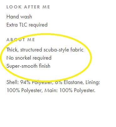
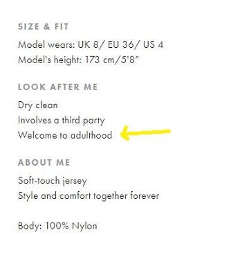
The quirkiest copy is usually found in the ‘About Me’ sections, where the brand cheekily injects random and funny info. Copy is also clearly targeted at its millennial audience, often referencing relatable topics such as money or adulthood.
2. Palace Skateboards
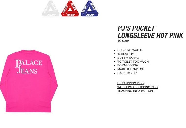
Product copy doesn’t often have a cult following, but fans of skate brand Palace can’t get enough of its infamous descriptions.
Putting a unique spin on the traditional bullet-point format, each one makes up a sentence or train of thought rather than separate points. They usually have nothing to do with the product or brand either.
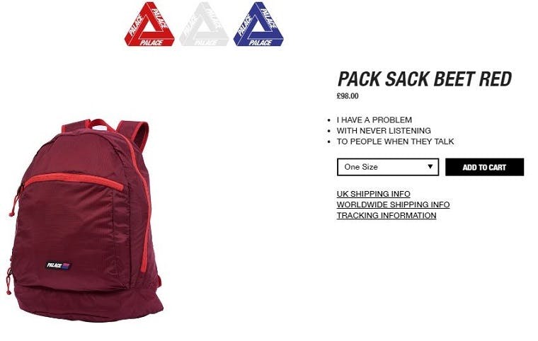
The product copy is reportedly the brainchild of founder Lev Tanju, whose childlike and infectious nature has helped make the brand a success.
Should others use this rather random formula? Most probably not, but it’s a great example of how product copy can be used to differentiate a brand or make it memorable.
3. Dollar Shave Club
Dollar Shave Club is known for its overtly-humorous ads, but its sense of fun extends to its website too (albeit in a subtler and more understated way).
Its product descriptions aren’t solely based on humour – they’re actually very informative, and largely designed to convey benefits – but there’s still a light-hearted tone which helps to engage consumers.
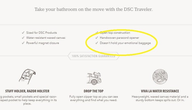
Humour can also make brands sound like they’re trying too hard, so its restrained sense of fun works well.
Its usual tactic is to include a funny bullet-point at the very end, which ensures consumers are left with a smile (and hopefully more of an incentive to purchase).

4. Firebox
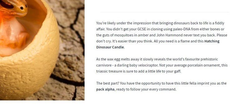
Firebox is arguably the most creative brand in this list, taking any opportunity it can to inject funny storytelling alongside its products.
The reason why the brand’s tone of voice works so well is that its products are usually off-the-wall – so why not include product copy that’s equally eccentric?
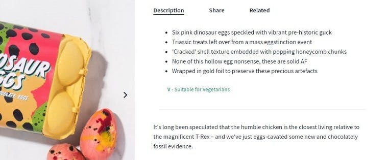
Unsurprisingly, the more bizarre the product, the more creative its copywriters tend to get, even extending wit and humour into the finite details or ‘specifications’.
5. Kallo
Kallo – a dutch brand best known for making stock cubes – takes a surprising approach to product copy on its website.
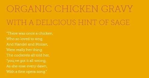
Instead of listing ingredients or talking about how delicious its organic low fat rice cakes are (said no one ever), it treats visitors to a poem on each page.
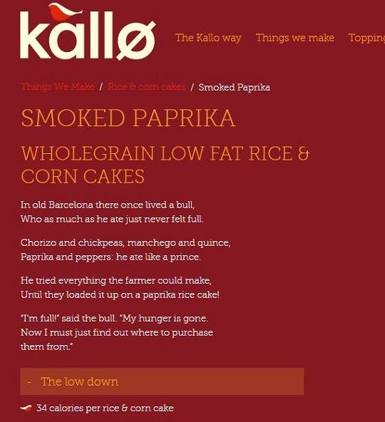
It’s all a bit random, but somehow contributes to a delightful and warm tone of voice.
The fact that the website is purely for promotional purposes – with no option to buy its products – means it does not need to rely on actionable copy to prompt purchases. So, poems it is then.
6. Old Spice
Old Spice has shed its uncool, outdated image to become a relevant and powerful brand name – especially in marketing circles.
Humour is the main reason, with the deodorant brand taking on a distinctive and original tone of voice, ironically designed to promote its ‘manly’ characteristics.
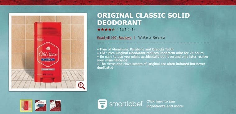
Its online product descriptions are no different, perfectly conveying its unique sense of humour.
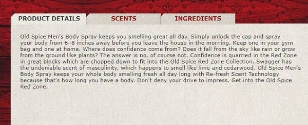
What are the benefits of staying fresh for 48 hours? Well, in the opinion of Old Spice – “that’s long enough to build a small house or navigate an especially large lake.” As you do.
7. Soap & Glory
Beauty and skincare brands are usually a bit more limited when it comes to product descriptions, often required to inform consumers about ingredients or benefits (backed up by scientific proof).
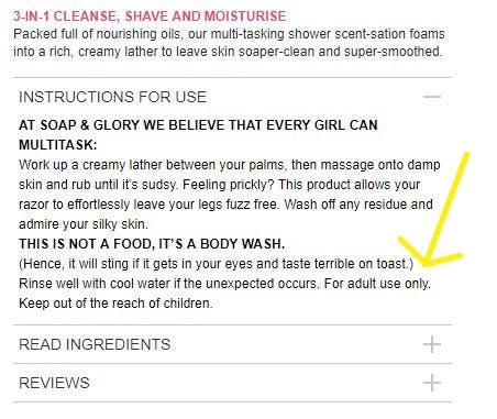
Soap & Glory strikes a good balance, with the brand injecting fun and gently-sarcastic wit into its product copy where possible. Its main product descriptions are reserved for singing the product’s praises (with a pun or two).
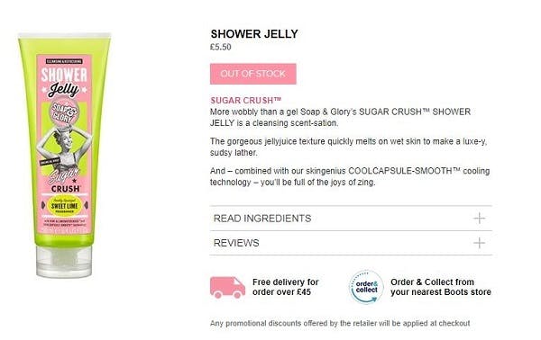
Meanwhile, it uses instructions as an opportunity to speak directly to consumers, and inject a bit of self-aware humour into what can often be patronising microcopy (e.g “Don’t eat this”).
8. Think Geek
Think Geek is a brand that sells unusual and quirky gifts, sort of like a nerdier Firebox. However, unlike its rival brand, it is much more succinct and to-the-point in its main product copy (as well as being funny).
It’s difficult to convey the benefits of a product in such a short amount of words, but Think Geek surprisingly adept at it, often doing so in just three bullet points.
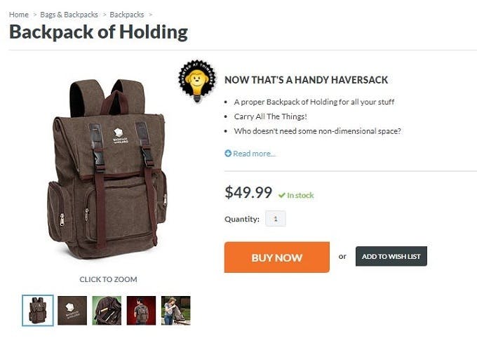
With more space further down the page, it also lets loose with creative and more in-depth copy.

9. Fab.com
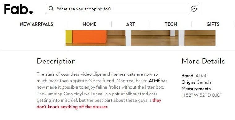
Fab.com isn’t very consistent with its product descriptions – there are a lot of products on its site that contain minimal and less creative copy. However, it does come up trumps on the odd occasion, infusing warm and gentle humour into its descriptions.
This example for a cat-themed wall decoration is one of the best, and proves why the brand should be more focused on creating consistency in its tone.
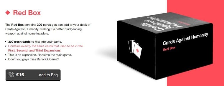
10. Cards Against Humanity
The game Cards Against Humanity isn’t for everyone and neither is the brand’s copy.
That’s exactly the point, however, as it is a shining example of how to create a tone of voice that delights a core audience.
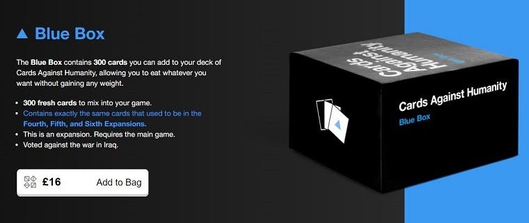
The descriptions for each game are brilliantly dark, sarcastic, and give new players an insight into what they can expect from the game – great for nudging potential consumers into making a purchase.
Related reading:

Comments