With news that Thorntons sold more chocolate online in the first half of its financial year than it did through its retail stores, now seems like a perfect time to compare Thorntons with Hotel Chocolat, the twin giants of chocolate retail, to see how their ecommerce sites compare.
Which retailer will be the golden-ticket-clutching ‘Charlie’ with a prize of not just a lifetime supply of chocolate but also the very factory itself, and which retailer will be shamefully named as ‘Augustus Gloop’ whose lack of foresight leads him to fall into a chocolate river and… uh… presumably drown.
“Who can take a sunrise, sprinkle it with dew, cover it in chocolate and a miracle or two?” Yeah, subtle.
Thorntons
As reported in Internet Retailing Thorntons’ performance in its commercial channel fell short of expectations, with sales of £62.7m down by 11.2% on the £70.6m earned during the same time last year.
However during the same period the retailer delivered a more profitable balance with its online sales, which were up 11.4%. Clearly Thorntons’ future profitability lies in ecommerce.
Homepage
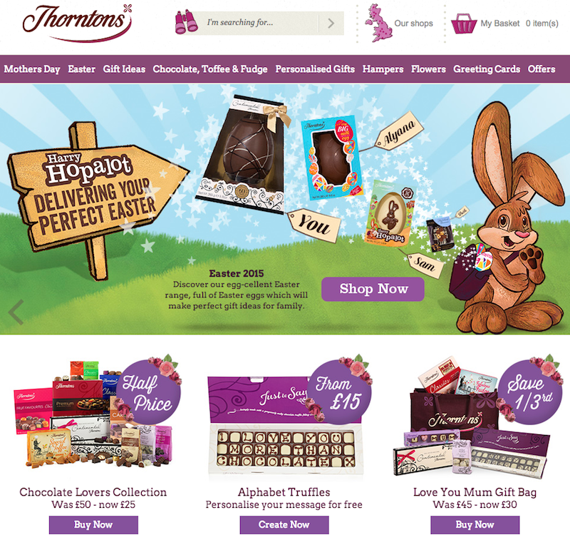
It’s a nice, bright, cleanly laid out homepage, with an emphasis on its three top products and seasonal gifts.

In fact that’s where its biggest strength lies, in positioning the next couple of chocolate gift heavy holidays first in the top navigation.

Obviously this is what the bulk of its traffic comes for, and its carousel reflects this by only highlighting these two holidays at a well-paced speed.
The mega-nav also features hoverable drop-down menus which attractively highlight products and key product groups with eye-catching thumbnail images.

Search
Unfortunately Thorntons doesn’t provide automatically suggested search results, nor does it save my previous searches.

Thankfully it does serve you accurate search results if you’ve made a spelling mistake.

Search results are well displayed, with clear large images. There’s also an easy to use sorting tool and it states how many products are available over how many pages.
The ability to increase the amount added to a basket direct from the results is also a good touch.

There’s also the ability to filter results on the left-hand side. The filters themselves are fairly standard, but it’s useful to be able to see results based on recipe or allergy information and special offers.

Slight improvements could be made in how the results load when a filter is chosen. An entire new page is loaded every time an option is clicked, which is rather time consuming.
Instead products could be sorted dynamically, live on the page itself.
Also, it would be great if when hovering over a product image you could see the outside packaging as well as the actual chocolate inside.
A bit like how on some fashion sites you can see the product on its own, and then how it looks while being worn on a real-life person.
Example taken from M&S:

Product page
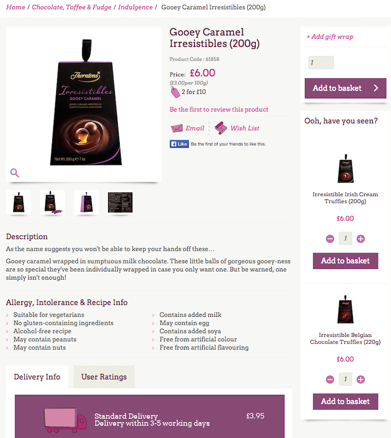
Clear pricing along with links to applicable special offers, large images with alternate views, strong copy and product descriptions as well as the ability to add to a wishlist make this a good product page.

The ‘ooh have you seen?’ is also a more personable touch than ‘customers also bought’.
Delivery options are also clearly stated at the bottom of the page, although you may be surprised to learn that there is no free delivery option, even over a specific threshold.

If you spend over £35 it’s a £1 flat charge for postage. If Thorntons just made it free, then at least it can still advertise ‘free delivery’ on the homepage and elsewhere on the site.
Free delivery, even with a threshold, is great for customer service, and surprise delivery charges during the checkout are a surefire way to increase cart abandonment.
Checkout
Checkout appears as if it can be completed on a single screen, which would normally be a great timesaver, unfortunately that doesn’t appear to be the case, as when you’ve completed your personal details, a brand new page for payment loads.
The ability to create an account is optional though, with just a simple password save.

This is essentially a guest checkout, but if it was all done on a single page it would be much quicker than most other examples.
There is however the option to pay with PayPal, to speed up the process.
The only worry I had during the process was being served the following message more than a couple of times..

The first time seemed to occur because my session had timed out, then the next couple of times it happened just after I navigated to payment.
Perhaps there is an incompatibility with Chrome issue. However it’s the wording of the error message that I take the biggest issue with.
“We missed your last click” does nothing to explain what has gone wrong, especially as physically clicking a button brought me this message in the first place.
Let’s see how Thorntons’ high street rivals compare.
Hotel Chocolat
As befits the brand, Hotel Chocolat’s homepage is a more sophisticated affair than that of Thorntons.

However that doesn’t mean it’s forgotten the key holidays, with Easter and Mother’s Day figuring heavily in the carousel, navigation and product highlights.
The mega-nav suffers from too much detail. Each drop-down menu contains an excessive amount of options, which could be streamlined into more general product groups and popular items.

However the major win it has over Thorntons is in providing information about its delivery options and free click-and-collect service at the top of the page and throughout the journey.
Search
The search box is fantastic, providing automatic suggestions and very attractive thumbnail images of each result along with the price and a CTA.

However if you make a spelling mistake you soon hit a brick wall.

And then if you click the search icon for that misspelling, Hotel Chocolat’s tool isn’t sophisticated enough to show you alternative results based on your entry.

The chocolatier is possibly losing frustrated customers here.
Search results are delivered attractively, with the search term, number of results and pages displayed clearly. You can view results by grid or list, sort by the usual parameters and filter by type, price or dietary requirement.

Much like Thorntons’ results page though, Hotel Chocolat is missing a trick not offering hoverable alternate views of the products and dynamic result serving.
Product page
Hotel Chocolat’s product pages are filled with lots of original touches.

The ‘drop a hint’ tool opens a pop-out window where you can input someone’s email address and Hotel Chocolat can emotionally blackmail that person to buy some chocolate on your behalf.
There’s also an up-to-date stock checker for in-store pick up.

Free personalised gift card service, customer reviews, options for giftwrap and my favourite touch… a carousel that you can click through for a close-up image of each chocolate contained in the box along with product information and allergy advice.

Checkout
Hotel Chocolat informs you the availability of PayPal right from the beginning, but unfortunately doesn’t offer a guest checkout. The map across the top also makes it seem like it may be a fairly lengthy journey.

I also feel that the entry fields are too small, along with the text itself.
This, along with the requirement for a password, builds another barrier to quick conversion.

Its only saving grace is in the range of delivery options available, including nominated day and free click-and-collect.
However with far too many steps, fiddly text entry fields, even smaller text and a lack of free delivery threshold (you can spend thousands of pounds on chocolate and still have to pay £4.95 delivery), this is a disappointing checkout experience.
In conclusion…
Neither site climbs the same dizzying heights as Charlie, nor drowns in the same brown swampy goo as Augustus Gloop.
Thorntons suffers from a mediocre search box and slightly frustrating checkout, but otherwise has great product pages.
Hotel Chocolat too has some brilliant product pages with original functionality and services, but it’s let down again by an unforgiving search tool and a poor lengthy checkout.
Both could use a site refresh, with each taking tips from the other. Thorntons could use some of its rival’s technical sophistication without losing its friendly charm, and Hotel Chocolat could definitely learn to be more user friendly without losing its luxury edge.

Comments