Thankfully, once in a while I am struck by marketing that keeps it simple and is more powerful for it. I received one such email recently from LinkedIn Research.
Here’s the subject line…
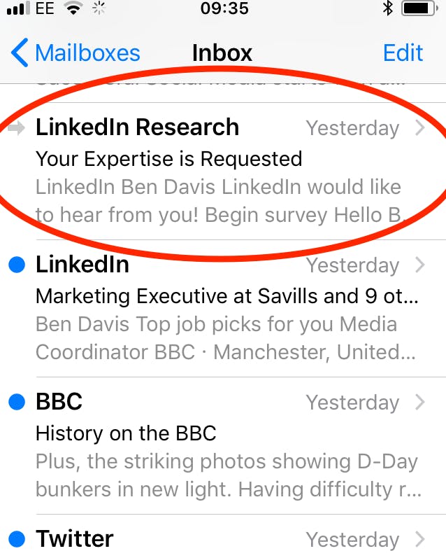
“Your Expertise is Requested”. Stuff all that twee copywriting, just appeal directly to my ego and I’m more than likely to open the email.
I should add that this email may have been more noticeable because I rarely, if ever, get emails from LinkedIn Research, so it stuck out. Is there a lesson there about limiting frequency? We’re going to stick to creative in this article, but check out Tim Roe’s take on frequency, still relevant five years on. For the retailers out there, I know more email mostly means more money, but for B2B marketers with complex propositions, could ‘softly softly’ with better targeting be the answer?
I’m also not going to get into the GDPR in this article, and whether I agreed to receive these emails, and on what basis the data is processed. I’m signed up with LinkedIn and this email was relevant to how I use the service, so that’s good enough for me (almost irrespective of what boxes I have checked).
Let’s look at the email creative itself…
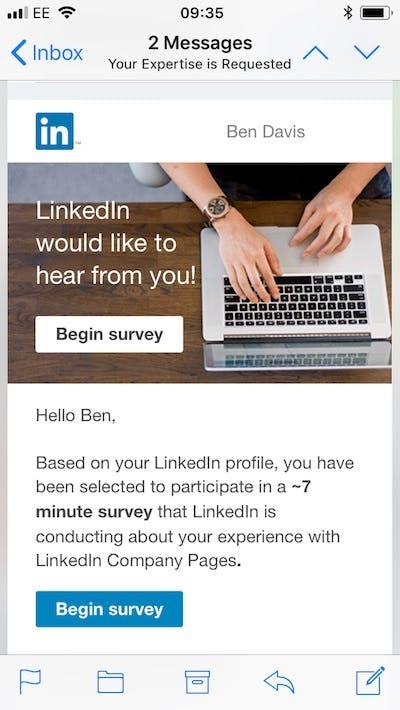
Well, it may seem a bit much to even call it creative, but it definitely works as far as I’m concerned. Again, it plays to my ego, “LinkedIn would like to hear from you!” – the fact that this is written in the third person (“LinkedIn” and not “We“) only increases the ego trip.
(As an aside, perhaps the first person plural pronoun is a bit overdone in B2B marketing nowadays?)
There are two calls to action, to make sure they catch me. Perhaps some recipients are only too happy to jump into the survey at first call to action, others want to read a bit more before they click.
“Based on your LinkedIn profile..” – again this is appealing to my ego, LinkedIn wants to hear specifically from me, based on my experience.
“..you have been selected..” – this is the oldest trick in the prize-draw book but I think it still works.
The copy is fuss-free and tells me approximately how much time the survey will take, as well as telling me in brief what the survey is about.
I like the sign-off and footer, too. Let’s have a look…
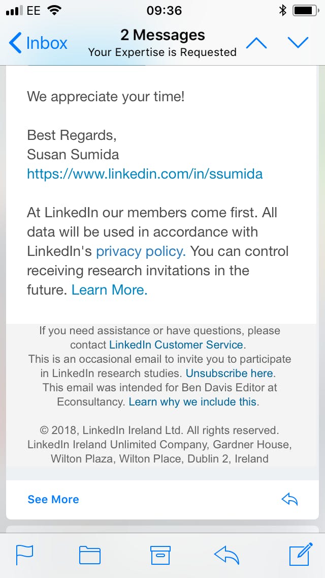
There’s a link to the sender’s LinkedIn profile – a nice touch to show the email comes from a real human being (even if it is a mass send).
Hygiene factors can all be checked off – clear links to privacy policy, contact preferences and unsubscribe option.
Do you agree?
This email wasn’t perfect. It wasn’t entirely mobile optimised – it appeared at about 60% zoom and I had to zoom in to get the content to fill the smartphone screen. The copy arguably didn’t tell me enough about the nature of the survey either, as much as it intrigued.
But on the whole, I felt there was beauty in the sheer straightforwardness of the creative.
What do you think, reader? Am I right? Or have I been indoors for too long? Do I need to get more sleep? Am I devoid of all joy?
Or could it be that many B2B email marketers have lost sight of clear copy, leaving the way clear for old school marketers to cut through with no-frills messaging?
I’m not sure I know the answer myself, and perhaps this email resonated simply because Econsultancy sends survey emails, too. Let me know what you think.

Comments