For the vast majority of businesses, the outbreak of Covid-19 and the lockdown that followed it has prompted an abrupt shift to digital.
Brands that previously had a multichannel sales strategy in place have in many cases effectively become pure-play e-tailers, while companies that lacked an online option or a sufficiently robust digital business are now either scrambling to create one – or have found themselves in deep trouble (in the UK see: Primark, Debenhams, Laura Ashley and more).
A survey of more than 450 UK brand-side marketers, carried out by Econsultancy and Marketing Week, found that close to half (48%) are responding to the Covid-19 pandemic by shifting messaging to emphasise digital fulfilment, products or services.
But marketers’ responses on the topic of customer experience (CX) and the customer journey indicate that the shift to digital has also exposed gaps in CX that will now need addressing more urgently than ever.
A new customer journey, and a lack of data
With consumers now carrying out almost all their interactions with a business through online channels, the customer journey is starting to look very different to what brands might be used to. Eighty-one percent of UK brand-side marketers stated that the Covid-19 outbreak has affected the customer journey(s) for their organisation to at least some degree, with 53% seeing a “significant” or “radical” change in the customer journey.
Many brands are also now finding that their customer experience doesn’t hold up as well in the midst of the crisis as they might have thought, with more than half (55%) agreeing that “the shift online has exposed gaps in our customer experience”. This is in spite of the fact that 80% of brands say that, “Our existing customer experience is able to adapt to the new customer journey”. And while the majority (77%) are confident that they have enough staff to respond to changes in the new customer journey, they are less sure about data: more than two fifths (42%) say that they do not have sufficient information about the new customer journey(s) to make informed decisions.
Customer journey mapping best practice guide
Without this data, how are UK brands making decisions about changes to their customer experience? Just 14% of brand-side marketers say that their organisation makes decisions about customer experience changes “mostly based on analysis/data”, with more than a third (34%) saying that they rely on “mostly instinct”. A little over half (52%) say that they use a balance of instinct and analysis/data.
While it’s understandable that some brands will have been caught out by such an abrupt and overwhelming shift in the way that customers behave and interact with their business, the inability to gather data on the customer journey points to a deeper issue with how brands adapt to changes in consumer behaviour of any magnitude – and the CX flaws being exposed by the shift to online shows how many brands might not have been as “digital-ready” as they believed.
UK brands: how does the digital CX hold up?
Statistics are all well and good, but there’s a lot they don’t tell us about where and how brands are falling down on their digital customer journey and CX. Fortunately, during the current crisis, like a lot of people I’ve had plenty of time and opportunity to visit various ecommerce websites and analyse their experience.
For the most part, my experience has been reasonably good – sometimes even seamless. But in an ideal world, seamless digital experiences should be the rule rather than the notable exception – and there are areas in which brands are falling down that I think could vastly improve the overall CX if given some attention. Here are a few examples.
Boots
The first time I had a go at shopping with Boots online, early into the lockdown, the experience was frankly horrible. I’m a regular in-store customer with Boots and have a loyalty card where I rack up tons of points, but I’d never needed to place an ecommerce order before. I was looking for a few things, among them cocoa butter, but the internal site search really wasn’t helping:

Boots internal site search sometimes struggles to surface the most relevant products (Image: Boots.com)
After a long battle to add the correct products to my cart, I finally tried to check out – and got a payment error that made me give up and head to Amazon instead.
I’m willing to cut Boots some slack, though, as I’m sure they were struggling at the time to deal with the unprecedented surge in demand caused by the pandemic. A month and a half on, the experience of using Boots online is much smoother: the internal site search brings up more accurate results (still not quite as helpful as I’d like, but better) and I was able to check out successfully with my order.
One feature that would have really improved my overall experience would have been the ability to see in the internal site search dropdown whether an item was in stock – as it was, I had to click through onto the product page before I could see, and as you can imagine, quite a lot of things were out of stock (hand wash, antibacterial hand gel, laundry detergent, even some types of plasters) which added up to quite a bit of wasted time.
I also searched for “throat numbing spray” and got no results, even though Boots did in fact stock an anaesthetic throat spray – this is one instance where a few linked synonyms could much more easily guide shoppers to what they’re looking for.

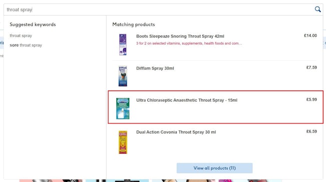
Image: Boots.com
Another gripe that I have with the Boots CX isn’t specific to the online experience, but relates to the loyalty card scheme. As I said, I make a lot of purchases and rack up plenty of points on my card, but very rarely if ever are the offers it gives me relevant. Boots must have all sorts of data on the kinds of items I tend to purchase regularly, or purchase on occasion (but might buy more often if presented with a nice two-for-one offer or discount) – but instead, I get offers for products I’m just not interested in, and as a result never redeem them.
This is one obvious area where the use of the customer data they already have would go a long way towards improving the loyalty scheme and incentivising customers to shop more with Boots.
Next
Next relatively recently opened up its ecommerce website again, after taking some precautions that would ensure its employees could work safely in warehouses by implementing a cut-off point for orders every day. While it famously hit this within hours of re-opening its online store, three weeks on, I was able to shop at my leisure without getting cut off by the cap.
I decided to take the opportunity to shop for some items I’d never got around to buying in clothing stores before the pandemic caused them to close their doors. Shopping for a few pairs of trousers went off without a hitch, but then I decided to look for a white or silver handbag – something that I’d been looking to add to my wardrobe for some time. Shopping for bags is easiest to do in person where you can get up close and personal with the details, check for things like inside pockets, and gauge the volume – but now we don’t have the option to do that, it’s up to brands to bridge the gap with their online experience.
Unfortunately for Next, as soon as I found a bag that I liked the look of, one huge issue became apparent: there were no sizing details given.
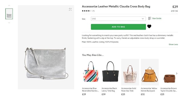
Shopping for a bag online can be difficult without detailed product information or photographs. (Image: Next.co.uk)
Given that measurements for an item are fairly standard in a PIM system, there’s very little excuse for not providing them – and to me, how useful a bag is for me hinges entirely on its sizing. Frustratingly, there also weren’t any pictures of the bag being worn or held by someone, which would at least have given me a rough sense of its size. In the end, there wasn’t enough information for me to make a purchase, so I left it.
To be fair to Next, there is a noticeable difference in the level of product detail provided on Next’s own-brand items versus the third party brands that it sells on its site, like Accessorize (the bag above), Quiz, Lipsy and others. Product listings like the Next utility bag pictured below are full of useful information including exact dimensions and multiple high-quality photographs, which can be zoomed in on to examine little details – everything I would need for an online bag purchase. The third-party listings, by contrast, are much more bare-bones and often missing important details.
Unfortunately, consumers aren’t going to differentiate between the two while shopping for an item; if the information that they need isn’t present, they’ll go elsewhere, and they’ll blame the lacklustre experience on Next, not on its third-party brands.
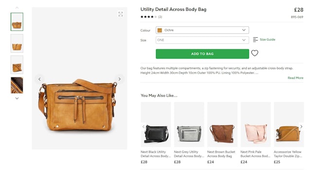
Next’s own brand product listings are much more detailed than its third-party listings – but at the end of the day, they’re all part of the same digital experience. (Image: Next.co.uk)
RSPB
Since the lockdown prompted me to make most of my regular purchases online, the RSPB website has become my go-to for bird food and other garden items like a new bird bath (the kind of thing I never got around to buying until I was spending a lot of time at home staring out of the window).
While it might seem a little unfair to be critiquing a charity for its online shopping experience, these kinds of revenue streams are increasingly crucial when other outlets (like conservation centres, gift shops and cafés) are closed for the foreseeable future – everything is now riding on their online presence.
Because I know it’s for a good cause, I’m more inclined to keep coming back to buy from the RSPB even when the digital experience isn’t perfect – but that doesn’t mean that they get a free pass for murky patterns like pre-selecting the most expensive item when I’m shopping for bird food. (The item in question was also out of stock, which earns the RSPB a double black mark as I couldn’t even add it to my basket if I did want to).

RSPB’s online shop has some murky patterns, such as pre-selecting the most expensive item out of a list of options (Image: RSPB Shop)
The first time I shopped with the RSPB, I did so on mobile, but have switched to desktop for subsequent visits after finding the mobile navigation to be very stilted and unhelpful.
After adding an item to my basket, selecting “Continue Shopping” will take me back to the item I was just viewing – but the site doesn’t present me with an easy way to go back to the main product category, which led to my selecting “Bird Food => Seed Mixes” over and over again from the hamburger menu in order to browse the rest of the products on offer. The experience is fine on desktop, but some more testing and thought about the customer journey on mobile is clearly needed.
How six non-profits are meeting funding & awareness challenges in the coronavirus crisis
Asda
I’m not a habitual online grocery shopper, but a couple of months before the pandemic happened I started doing more regular online grocery shops through Asda, because it’s a more convenient way of carrying out a big grocery shop when you don’t have a car. Unfortunately, the coronavirus pandemic mostly put paid to that option, because grocery delivery slots suddenly became as rare and valuable as gold dust.
Since things have settled down a bit, I’ve wanted to get back into ordering groceries from Asda, but the biggest problem is that the site doesn’t present shoppers with a way to view available delivery slots until they’ve signed in – and there’s no sign-in button on the homepage, which means that I have to attempt to add an item to my basket before I’m presented with the option to sign in.
To add insult to injury, when I did search for products a banner at the top of the page admonished me, telling me to “Check for an available slot before you shop” – but the site doesn’t give shoppers a way to do that. Even a hyperlink in the banner that led me through to the delivery slot booking page would have been better than nothing – as it is, it’s a bit laughable that Asda tries to tell shoppers to do something without presenting them with any opportunity to do so.

Asda tells shoppers to “Check for an available slot before you shop” – but doesn’t present them with the option to do so. (Image: Asda.com)
There are a lot of good things about Asda’s ecommerce interface – one feature I particularly like is the fact that when viewing a product page, you can navigate across to view recipes using that product. But these kinds of UX innovations aren’t enough if more fundamental things are causing shoppers frustration – particularly in a pandemic when the most important priority is for shoppers to get what they need with the minimum of stress.
Suttons
Garden supplies vendor Suttons might have been established in 1806, but that doesn’t mean that it doesn’t have a modern online presence. When I went to its online store looking for plant pots, I found myself queuing digitally for the first time ever – Suttons is managing the load on its website by staggering the number of people who can browse at one time. It never takes long, and the interface is good at providing updates on when you’re likely to enter the website, so it’s not really a bother.
Overall, I’m impressed by the digital experience – I particularly like how Suttons highlights flowers and vegetables that can be grown that month on its homepage. The top nav offers a wide array of different categories to be browsed, so many that the options border on overwhelming – but it makes for great inspiration if you don’t know exactly what you’re looking for, and the internal site search works well if you do.
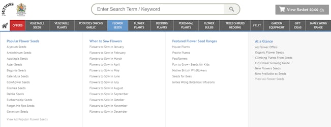
Suttons’ website navigation offers plenty of categories to browse – a range that can seem intimidating for the uninitiated, but also offers plenty of inspiration (Image: Suttons.co.uk)
My only quibbles are that the mobile site navigation is fairly clunky, like the RSPB’s, and the mobile website lagged quite a lot even with the load managing system that Suttons has in place.
Some of the filters also don’t seem to work as intended, as I filtered by “in stock only” but still found myself presented with plants that were marked as “currently unavailable” – which can be frustrating when you’re trying to find what’s actually available to buy.
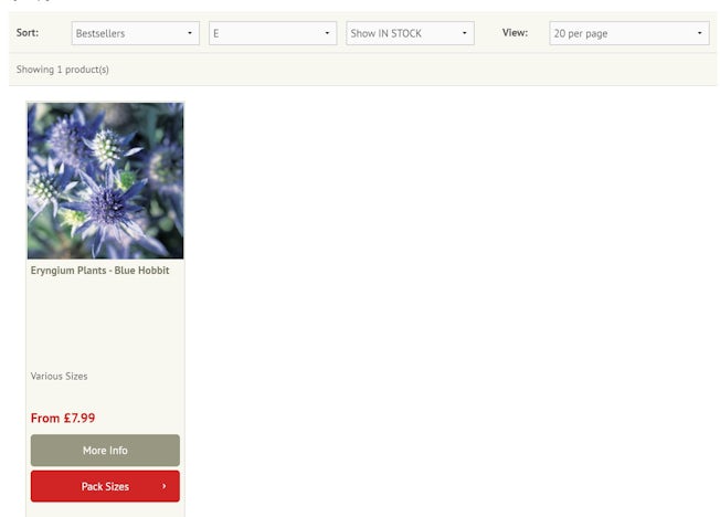
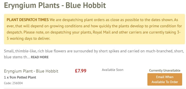
Image: Suttons.co.uk
Conclusion
While the websites I reviewed for this article have their shortcomings, there’s also plenty to be said about what they’re doing right, and that shouldn’t be overlooked either. At the end of the day, all of the brands listed in this article are currently doing their best to keep up normal operations in the midst of an unprecedented situation, and for the most part are doing a solid job of it.
It can be argued that all businesses should be providing a stellar digital experience regardless of the circumstances, but in reality we know that’s easier said than done – particularly when, instead of having the time to progressively shift their model more towards digital, they are forced to reinvent themselves as pureplay e-tailers practically overnight.
Acknowledging this, however, doesn’t mean that we can’t still hold brands to a high standard of digital experience. For the foreseeable future, these are the terms brands need to be thinking in in order to drive more sales and continue to delight their customers; with the in-store experience likely to be impacted by coronavirus safety measures for a long time to come, the digital experience is where brands need to truly differentiate themselves in order to stand out and remain as competitive as possible.

Comments