The reasons for this are said to be varied, ranging from reading product reviews to comparing prices.
Alongside this, of course, is the simple fact that smartphone usage in general is on the rise, irrespective of the retail context. This means that mobile provides a big opportunity for retail brands to meet shoppers on these devices, regardless of what they’re using them for.
With this in mind, here are a few examples of retailers embracing smartphone usage in-store, and integrating it into the physical shopping experience.
Personal shopping assistant
While many retail brands facilitate smartphone usage in-store, others are using it to completely digitise the physical shopping experience. Earlier this year, German retail chain Bonprix opened a concept store called ‘Fashion Connect’, which aims to combine the best of both online and offline shopping.
Upon entering, customers are asked to check in on Bonprix’s app, which then serves as a personal shopping assistant throughout their time in-store. Customers can scan any items they want to try on, select the right size, and send items to the fitting room. The smartphone app also allows customers to tweak lighting, request sales assistance, and eventually pay.
According to managing director, Markus Fuchshofen, “Bonprix has given the smartphone a central role in this pilot store precisely because it is so omnipresent these days.”
Of course, there is the danger that a solely app-driven experience could alienate customers that do not want to use their smartphone in this way. However, it’s unlikely that Bonprix’s pilot concept will be expanded (or made compulsory) across the entire chain just yet.
Added convenience
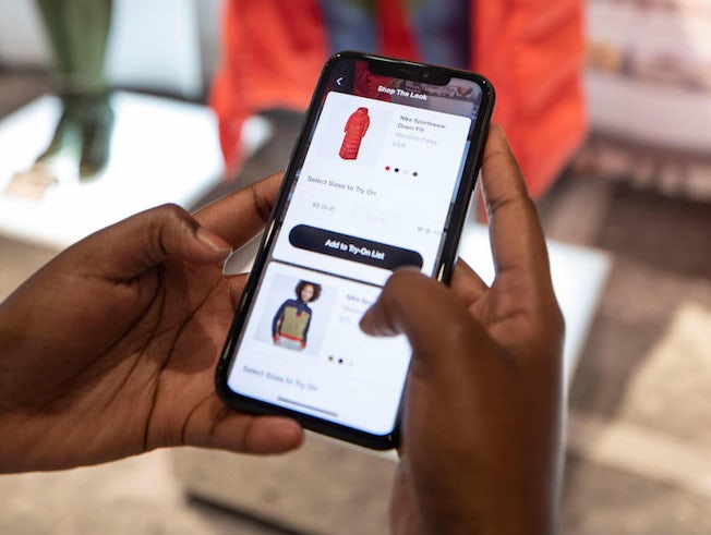
Elsewhere, we are starting to see brands integrate mobile in a more realistic (and permanent) way. Nike is one prominent example; its ‘House of Innovation’ store in New York City (as well as the Nike by Melrose store in LA and the forthcoming Nike Live stores in Long Beach, CA, and Shibuya, Tokyo) incorporates digital elements throughout, powered by the Nike app.
It includes various features that aim to speed up and simplify the shopping experience. ‘Instant Checkout’ allows customers to scan and pay for any item (with a saved credit card), without queuing or interacting with staff. Additionally, the ‘Shop the Look’ and ‘Scan to Try’ features allow customers to request items or find the right size, again without engaging with Nike employees.

For the brand, the aim is not to completely digitise the physical shopping experience, but to create a tech-driven experience that aligns with all types of shoppers. Someone who is short-on-time and comfortable with mobile features is just one example. At the same time, features like ‘Nike by You’ – which allows shoppers to customise their own shoes – are aligned to relaxed customers who want a more entertainment-driven experience.
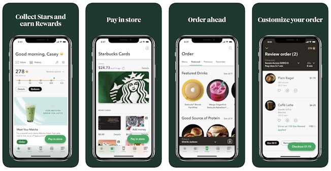
Other retail brands are also using mobile to help facilitate checkout. Starbucks’ ‘Order and Pay’ feature on its mobile app has been hugely successful; 12% of Starbucks’ total sales also came in through its mobile ordering feature at the end of 2018.
Starbucks has also worked hard to improve the system, making subtle but impactful changes, such as sending alerts to customers when their drink is ready (rather than having the barista shout out their name). Order and Pay is now available to all customers – not just rewards program members. Essentially, Starbucks has made mobile central to its customer experience. Not only does this create a more seamless journey for customers, but it also allows Starbucks to build loyalty as well as target app users with relevant advertising.

Signposting
In-store navigation has been around for a while now, with brands like Lowes and Walgreens using augmented reality to help customers find what they’re looking for in-store. While somewhat helpful in theory, this kind of technology can be clunky and difficult for users to get to grips with.
In the past year or so, however, we have seen retail brands up the ante on navigation. Earlier this year, US grocery chain Kroger revealed its new digital shelf technology, which – as well as digitally displaying product prices, offers, and ads – can also help customers tick off items on their shopping lists. Linking with customer’s smartphones, it offers a guided shopping experience; digital price tags light up with emoji-style icons to signify that an item is on the customer’s shopping list. Customers can also scan the items as they put them in their basket, which alerts the app to guide them to the next and nearest item on their list.
While Kroger’s two new stores are not cashierless like Amazon Go, the initiative still aims to compete with the latter’s hi-tech experience. The guided shopping experience is certainly a unique offering, and a further indication of where grocery retail is heading.
From digital shelf displays to greater personalization, @kroger is innovating the grocery industry with #AI. ????
Learn how they're helping shoppers find food inspiration: https://t.co/JrRM87GGHk
— Microsoft (@Microsoft) October 17, 2019
Another interesting development could also be in terms of lifestyle and dietary choices. In 2018, Kroger’s chief information officer, Chris Hjelm, told Business Insider: “If you are standing in front of nutrition bars and you are gluten-free, we would highlight for you, in your colour of choice, which of the gluten-free bars are good for you.”
It’s unclear how sophisticated this feature currently is, but if further developed, it could save shoppers (with specific dietary requirements) even more time, and prevent them from having to read through extensive lists of item ingredients.
Sharing and discovery
The majority of retail brands use their own apps to encourage smartphone usage in-store. However, others also recognise the benefits of third-party social media apps, in turn creating in-store experiences that align with high levels of consumer usage.
As Adweek suggests, “these days, if consumers can’t Instagram a store, it’s almost not even worth going.” So, instead of using social to merely drive customers in-store, some retailers are using brick-and-mortar locations to encourage social sharing – and ultimately increase word of mouth marketing. There have been some crude examples, such as Missguided’s first physical store, which displays signs encouraging shoppers to follow the brand on Snapchat.
In more recent years, however, physical retail has evolved to become much more sophisticated, using creative design to create highly impactful (and shareable) spaces. Glossier is one of the most well-known examples. Its most recent opening – a long-awaited London store – has been described as “a Willy Wonka experience for make-up hypebeasts”.
With highly immersive and stylistic elements, it has been designed so that customers will want to visit – purely for the purpose of posting about it on social media. Glossier is surely hoping that customers buy something, too, but it’s doubtful that it is the brand’s main motivation, especially when its online sales are so high.
In an era of experience retail, Glossier demonstrates why brands are embracing the fact that customers are glued to their smartphones.

Comments