In the UK, online sales in July measured 50.4% higher than in February, despite brick-and-mortar stores having reopened the month before.
According to a McKinsey study conducted in June, 71% of UK consumers have tried a new retailer or brand since the Covid-19 outbreak began, citing value, availability and convenience as key reasons for doing so. I was certainly one of those people, throwing brand loyalty out of the window where I was unable to visit a store, or unable to find the product I was looking for from my go-to online retailers.
Many ecommerce experiences I had during the height of lockdown were at best mediocre and at worst, showed that the brand was immensely unprepared to handle such a shift in consumer habits. However, there were a few that really impressed me for a range of reasons that span UX, CX and post-purchase marketing. Here are my favourites and what other brands can learn from them.
1. Il Makiage
New York based cult cosmetics brand Il Makiage was one company that decided to push its products via targeted social ads throughout the peak of the crisis. Knowing that much of its target audience was unable to make a trip to their nearest drugstore, let alone use testers if they could, it frequently highlighted its popular ‘PowerMatch Quiz’, which supposedly matches your complexion to one of fifty available foundation shades on their website. In fact, the brand was so confident in the accuracy of this quiz that it offered a 60-day money back guarantee alongside it if it wasn’t for me.

An Il Makiage ad on Instagram that invites customers to try the foundation “risk-free for 60 days”. Screenshot via Instagram.
I was sceptical, but as the foundation I was wearing at the beginning of the year was drying out and I didn’t have anything else to do, I investigated further. The quiz was relatively quick and quite enjoyable to complete, covering topics such as skincare concerns, desired coverage, and undertones. A detailed series of photographs halfway through evidently used the input of thousands of other people before me to help determine the most suitable shade based on my answers.

Il Makiage’s PowerMatch Quiz uses detailed photographs in combination with other questions to match customers with their ideal shade of foundation. Images via Il Makiage.
After submitting my email address at the end, my perfect shade was revealed and emailed to me for reference. Skip a few days and the foundation arrived, marking the first of many random lockdown purchases that would grace my doorstep over the coming months (more on those later).
It turned out that I didn’t need that 60-day guarantee after all, as the shade selected for me was spot on, despite my original scepticism. Overall, I was impressed enough with the website experience and product that I would readily consider returning to their site to purchase more at a later date. However, the marketing correspondence I received post-purchase would have no doubt swayed me if I was still undecided at that stage.
Pretty soon after my makeup arrived, I received a series of emails, all of which were well-presented, consistent with the brand and simple to read.

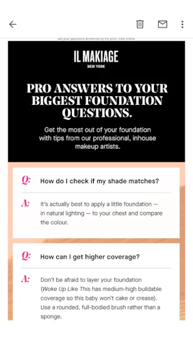
Il Makiage uses email marketing to invite customers to share selfies post-purchase and offers extra value-added with tips from professionals. Image via Il Makiage.
The first two addressed immediate post-purchase actions: sharing a selfie on Instagram and having any questions I had about the foundation answered. Il Makiage made sure to point out that the answers to the frequently asked questions featured in the body copy came straight from their in-house team of pro makeup artists.
Not only does this make the customer feel that the brand cares about their ongoing experience with the product they purchased, but the free professional tips translate into better value for money.


Il Makiage follows-up post-purchase to invite customers to a virtual tutorial and Q&A, as well as inviting them to try out similar products. Email marketing via Il Makiage.
Later, I received further communication which included invitations to join a free virtual makeup tutorial and to sample a brow product by taking another online quiz. While I didn’t take either offer up, they would have certainly added to the brand experience and sense of exclusivity I had felt already. I also enjoyed the casual, personal tone of voice used, which reflects the helpful, empowering nature of the brand.
What brands can learn from Il Makiage
- Covid-19 has led unprecedented numbers of consumers to explore new brands online. Brands that show faith in their products by offering a money-back guarantees or introductory discounts give consumers fewer excuses not to try them out for the first time.
- With customers unable to test or try products in store for an extended period, brands that implement technology like AR or comprehensive quizzes are more likely to give consumers the confidence to take that first step to conversion. Virtual experiences leading to purchase, when done well, will be enjoyable for customers and will thereby make your brand more memorable to them.
- Continue engaging with customers on a regular basis after they’ve converted. Provide them with bite-sized pieces of content to complement their purchase – in this case, these took the form of Q&As, makeup tutorials, and freebie offers.
2. Pet Drugs Online
Partway through lockdown, I’d run out of monthly flea treatments for my two cats. By that point, well-known pet retailers had faced huge online demand and were frequently out of stock, so I browsed the internet for other options.
I found the Pet Drugs Online website, which was ranked high in my search results. Straight away I was impressed with the homepage. It was spacious and not too cluttered, leaving key information to take centre stage – in this case, highlighting its ‘safe, hygienic, non-contact delivery’ method, Feefo trust rating and most crucially, a contact number for any queries. The position of the search bar was also very obvious, meaning I could get started finding what I needed straight away.
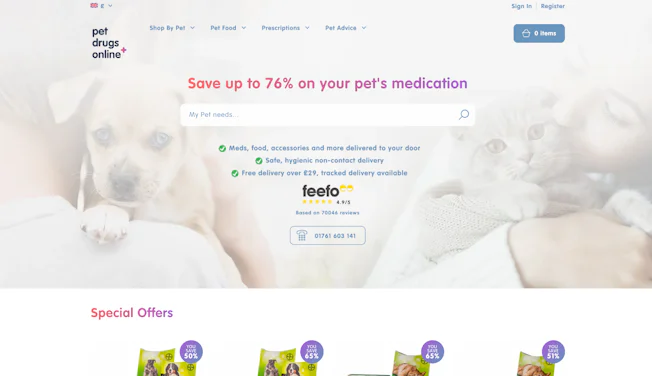
Pet Drugs Online has a spacious, visually appealing homepage design that emphasises key information. Image via Pet Drugs Online.
As with all healthcare brands, it is important that customers are able to trust the products as much as the customer service. Pet Drugs Online had this covered with a series of banners (or USP bars) scattered throughout its website emphasising that its pet medicine was genuine and that the brand was a fully accredited online vet pharmacy. Combined with satisfying green ticks, these banners helped put my mind at ease while I was browsing.
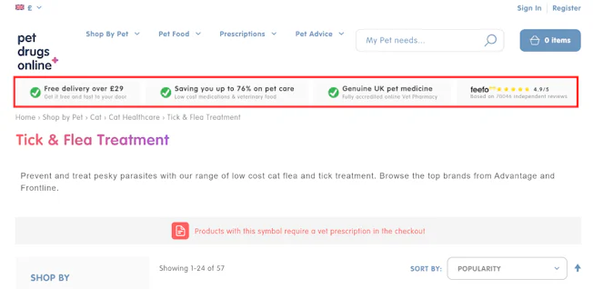
Banners on Pet Drugs Online’s website emphasise its value selling points, including free delivery and lower prices. Image via Pet Drugs Online.
One of my favourite parts of the website was its dynamic search bar. When searching for a particular type of medication, all the essential information was displayed on each result, including the name of the product and a good quality image of its packaging, overall customer rating, original RRP and discounted Pet Drugs Online price. There was also a suggestion box to the right hand side, which could be used to narrow down a search even further without the need for additional typing.
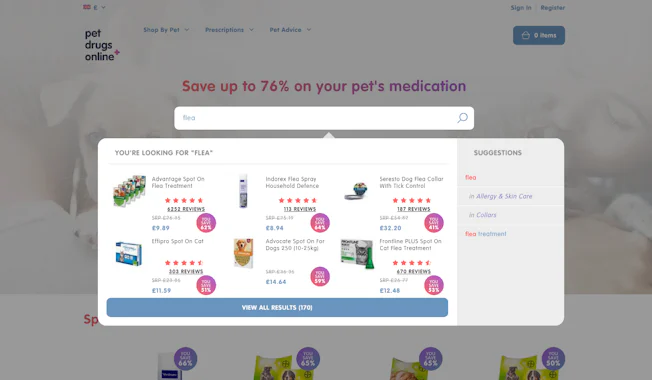
The dynamic search bar makes searching on Pet Drugs Online a more inviting experience, and features embedded pricing and ratings information. Image via Pet Drugs Online.
Once I’d created an account in a few simple steps, the account dashboard that appeared was really slick and easy to navigate, with a series of simple buttons directing me to past orders, prescription details, favourites and stored addresses and cards.
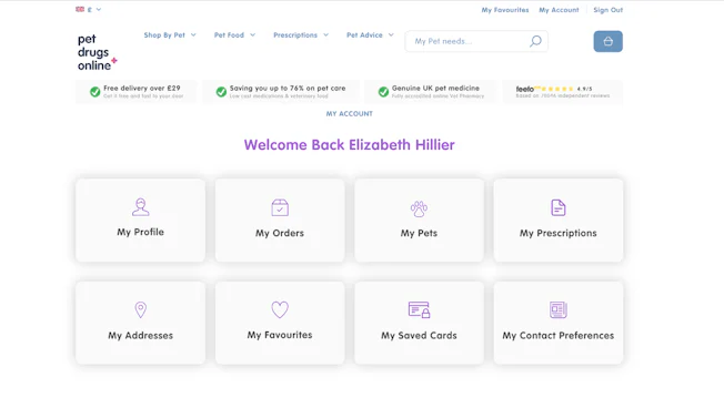
Account dashboards make it easy to browse past orders, prescription details, and other saved information. Image via Pet Drugs Online.
By far the most useful part of having an account was the ability to store information about multiple pets. I created a profile for each of my two cats, which included data on their age, weight, sex and any ongoing medical conditions. Orders can then be distributed across specific pets by selecting one at checkout, for example if one needs a particular prescription but the other doesn’t. Not only is this helpful for vets when dispensing the products, allowing them to make sure what has been purchased is suitable, but it also helps me as a pet owner to have a written reference of their data while I browse.
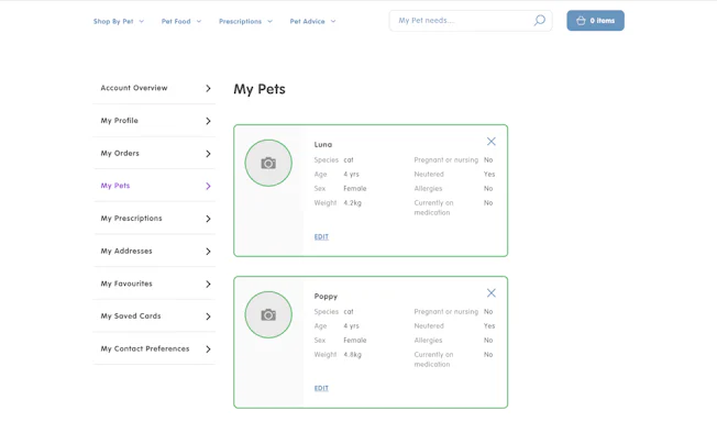
Pet profiles provide a handy written reference of pet data while also facilitating personalisation. Image via Pet Drugs Online.
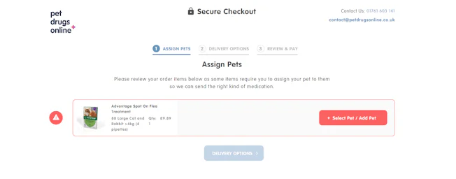
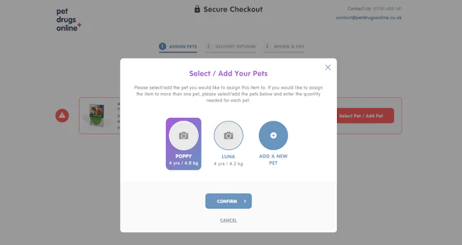
The checkout process provides the option to assign products to a specific pet. Images via Pet Drugs Online.
Despite adding a couple of additional steps, these extra details made the overall experience much more frictionless, as they cut out the need for a vet to contact me separately about my pets’ details after placing an order. They also gave me assurance that orders were checked thoroughly before shipping, increasing my confidence in the legitimacy of the brand.
What brands can learn from Pet Drugs Online
- Many people bought medical prescriptions and supplies online for the first time during lockdown. It is important that brands take extra steps to reassure customers that the products they are browsing are the genuine article if they have not yet built up trust. Informative banners, customer reviews and clearly visible contact details placed throughout a website are all excellent ways to do this.
- Dynamic search bars help customers find what they are looking for quickly and easily. Added product imagery next to each result makes it even easier to identify the brand they are looking for.
- Allowing customers to view past orders and ongoing prescriptions via a comprehensive customer portal allows both parties to access key records.
3. Center Parcs
Like many people, I’m not quite ready to jet off abroad for a holiday this year. Getting slowly more desperate for a break, I decided to check out what was available closer to home. Having visited Center Parcs before, I took a look at its website to see what was on offer.
Most importantly, I needed to see how flexible their cancellation policy was before I could even consider making a booking, given the ever-changing situation surrounding Covid-19. Center Parcs had clearly predicted this as, once I’d landed on the homepage, its new ‘book with confidence guarantee’ was highlighted on a bar just above the hero image. Below that, in large lettering, was an announcement stating they were ‘open, including Subtropical Swimming Paradise and Aqua Sana’ with a call to action to find out how the Center Parcs experience had changed in light of recent circumstances.
These three very short and simple bits of copy instantly restored my confidence and offered me the chance to find out more about Center Parcs’ cancellation policy and new safety precautions straight away, without having to search for them.
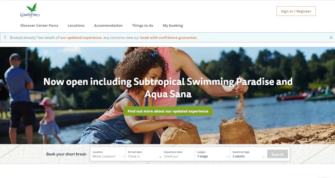
The Center Parcs homepage highlights its “updated experience” and “book with confidence guarantee”. Image via Center Parcs.
The ‘Book with Confidence Guarantee’ landing page wasn’t much to look at, but contained bullet-pointed information about cancelling or moving my break if circumstances meant I had to – for example, if I was impacted by a local lockdown or had Covid-19 symptoms in the lead up to the break. There were clear links to the lockdown impact form and contact details in case I needed to take action. Below that were a series of useful drop-downs explaining key changes that had been made, which is an excellent way of dividing information up into smaller chunks, rather than simply having a wall of unending text.


The ‘Book with Confidence’ page on Center Parcs website is functional but contains all the need-to-know information, with dropdowns breaking up the text. Image via Center Parcs.
Reassured that I’d be able to cancel or reschedule my break if necessary, I decided to look further into what was meant by an ‘updated experience’ from the call to action on the homepage.
I was greeted with a page that was sectioned into topics, such as arrival and departure, activities and accommodation. Each of these sections included easy to read tidbits of information, an accompanying video, and a call to action directing me to more detail. The videos were a great way of reiterating key information in an engaging way and breaking up the page – the visuals also made me more excited to book.

Center Parcs’ ‘updated experience’ page is easy to read, with informative videos and calls to find out more. Image via Center Parcs.
I really appreciated how thoughtful and thorough Center Parcs was when presenting all the need-to-know changes that had been put in place since Covid-19. Everything I wanted to find out was displayed prominently on the homepage, meaning I could read it straight away without needing to search for it.
What brands can learn from Center Parcs
- As with Pet Drugs Online, reassurance is key. Consider breaking up long sections of informative copy by including short videos or animations outlining any changes to usual procedure.
- The UK is still not out of the woods when it comes to Covid-19, which is why travel and leisure brands must show empathy by keeping booking terms and conditions as flexible as possible. Reiterate this flexibility in the form of banners or call-to-actions as soon as customers land on the homepage, dedicating a separate page to the information where needed.
- During such an uncertain time, it is essential that brands maintain their website and messaging as frequently as possible so that all information presented is up-to-date and reflects government guidelines.
4. Glasses Direct
The return of glorious sunshine reminded me that I needed a new pair of prescription sunglasses. Swayed by my unwillingness to make an appointment at my already very busy brick-and-mortar opticians, and hoping to save a bit of money, I chose to buy them online for the first time.
I’d heard of Glasses Direct before, but never got around to buying from them until now. The homepage was rather generic and unassuming, but it was easy enough to use the menu to start browsing women’s frames within moments.

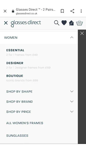
The Glasses Direct homepage and navigation menu on mobile. While the design is unassuming, the menus are straightforward and clearly laid out. Images via Glasses Direct.
The style and shape of a pair glasses can be a very personal thing, especially if you have to wear them all the time, which can often put shoppers off from using online services. I noticed a ‘Help Me Choose’ drop down on the website’s main menu, which contained a range of handy tools and tips including advice on face shape, a ‘best fit machine’, and offers for a free home trial and/or free second pair.
While these various pages might take a bit of sifting through, it was encouraging that there were multiple ways to find a style and fit that suited me best. The seven-day home trial offer would be an excellent option for those who are unsure where to start, as you can select from up to four frames at once, whereas the ‘best fit machine’ uses measurements from your existing pair of frames to find a direct or similar match.
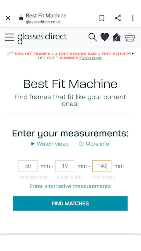

The ‘Best Fit Machine’ allows customers to enter measurements from their current pair of frames to find a pair with a similar fit. Images via Glasses Direct.
Having worn glasses for as long as I can remember, I have a good idea what suits me and what doesn’t, so I browsed the product listings instead. Once I’d chosen some frames, I was able to add them to my home trial or to my favourites list, or continue on and select my lenses, which is where my experience of the site really picked up.
What followed was a step by step menu of various options I could choose from: vision type (i.e. distance or reading); tinted, clear, or light adaptive lenses; tint colour; lens thinning; and scratch resistance and anti-glare coatings – meaning I could personalise the glasses to my exact needs. All the while, each option displayed a clear additional price which was added to the subtotal at the bottom of the screen. I could also go backwards and forwards using the breadcrumb navigation if I changed my mind.
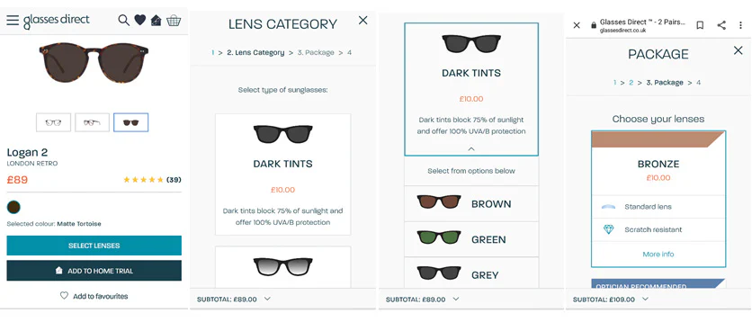
A step by step menu of options allows customers to personalise their glasses to their needs. Images via Glasses Direct.
Adding my prescription was just as simple, with two different forms to fill out depending on the type of prescription your optician normally uses. I was especially pleased to see that I could send my prescription via email at a later date – a useful option to keep the checkout process as smooth and as quick as possible.
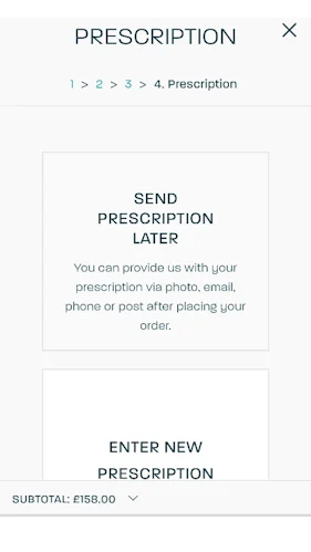
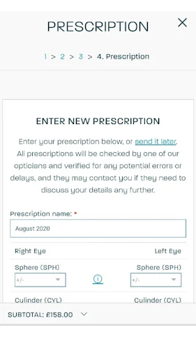
Customers have the option of enterting their prescription now or sending it after purchase, which reduces friction in the checkout process. Images via Glasses Direct.
There’s no doubt that the Glasses Direct website has room for improvement. The menu could have been a little less cluttered, the homepage more engaging, and in an ideal world it would have been brilliant to try on frames via some sort of AR functionality. However, once I’d chosen my glasses, the step-by-step process to purchase was really user friendly. Overall, I would probably order sunglasses from them again in the future.
What brands can learn from Glasses Direct
- If it is essential for a product to be personalised before purchase, make the process as easy as possible for the customer by offering clear instructions and step-by-step breadcrumb navigation. Ensure that any data input fields are simple, yet robust so that fewer additional checks or alterations are needed after checkout.
- When making a more complex online purchase, such as a pair of glasses with a particular prescription, customers prefer functionality over spectacular visuals. While both are important to brand perception, websites should initially hone overall user experience and usability before moving on to improve ambient design.
- Avoid last minute surprises at checkout by keeping a price tally on display as the customer selects add-ons for their product.

Comments