Why is data visualization important?
In his 2010 TED talk, David McCandless argued that sight has by far the fastest and biggest bandwidth of any of the five senses.
About 80% of the information we take in is by eye, he said.
Students get very excited – and policy-makers and the corporate sector – when they can see the data.
Researchers Emre Soyer and Robin Hogarth conducted a study in which three groups of economists were asked the same question concerning a dataset, and the results seem to support McCandless’s claim:
- One group was given the data and a standard statistical analysis of the data; 72% of these economists got the answer wrong.
- Another group was given the data, the statistical analysis, and a graph; still 61% of these economists got the answer wrong.
- A third group was given only the graph, and only 3% got the answer wrong.
The above results suggest that the visualized data on its own, without the accompanying analysis, was actually the most powerful format.
But let me take my own advice and provide some visual examples…
The internet in real time
Slightly terrifying, this one, but it’s a goodie. A real-time visualization of data from all the biggest sites on the internet.
Even if you work in digital, prepare to be amazed.
Battle of the internet giants
By the same people as the internet in real time site above, this one shows you how much money all the big boys in digital are making. In real time.
Excuse me while I have a cry.
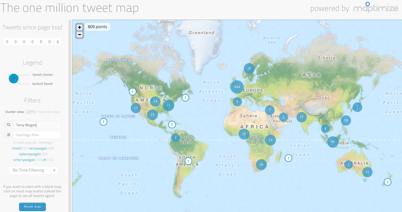
The one million tweet map
This is a good one for checking out geographical data for Twitter. It uses a clustering engine to visualize how people are tweeting about specific topics around the world.
In the image below the keyword was ‘Terry Wogan’.
Tweetping
Live display of people tweeting across the world, but it leaves the ‘pings’ in place so the longer you watch the map the clearer the geographical trends become.
Listen to Wikipedia
Perhaps my favourite example on this list: a live visual and musical representation of Wikipedia edits.
Bells indicate additions and string plucks indicate subtractions, and the pitch changes according to the size of the edit (the larger the edit, the deeper the note).
Green circles show edits from unregistered contributors and purple circles mark edits performed by automated bots.
It’s strangely addictive, so click that link only if you’re prepared to spend your entire day watching and listening to dots. You have been warned.
Google Trends
We’ve written about Google Trends plenty of times on this blog, but this little bit of data visualization is wonderfully Google-like in its simplicity.
It fills the screen with live trends and when you click on the text you’re taken to a Google SERP for that keyword.
Earth wind map
You don’t need to be a geography buff to appreciate this. A live visualization of wind around the world: direction, speed, and so on.
You can drag the globe around and zoom in on specific points for greater detail. Just awesome.
NOAA weatherView
More weather visualization, except this one allows you to see representations of various types of weather data such as temperature, precipitation, pressure and so on.
Every noise at once
A scattergraph plot of almost any musical genre you can think of. When you click on any of the text you get a 30-second clip of a song in that genre.
Its creator – Glenn McDonald of Spotify-acquired Echo Nest – explains the organisation of the genres as follows:
Down is more organic, up is more mechanical and electric; left is denser and more atmospheric, right is spikier and bouncier.
No Homophobia
This site provides live visualization of all the homophobic language being used on Twitter, including live tweets containing homophobic keywords.
Digital attack map
This shows you where DDoS attacks are happening around the world, which is an attempt to make an online service unavailable by overwhelming it with traffic from multiple sources.
Not sure if I completely understand it, but damn if it doesn’t look and sound cool.
Flight misery map
A handy one for any travellers. Hover over an airport and get a neat little visualization of all outbound flights and their status.
Green means good and red means bad. Can’t ask for simpler than that.
Spotify musical map
An interactive map that shows what music people are listening to in towns and cities across the world.
London is mostly big on grime right now, apparently.

World population
Ridiculously simple but still kind of mesmerising, this site shows the world population increasing in real time.
Click ‘watch as we increase’ to see the little stickmen appear in real time.


Comments